What’s in my Inbox?- Everlane Email Review

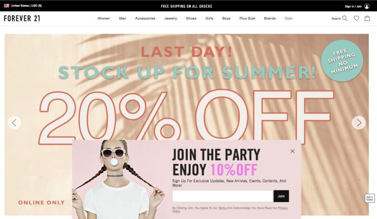
On average I wake up to about 15 unread emails each day that consist of beauty tips, new product info, promotional sales, work emails, and of course spam. Competition is high within my inbox, with only a few emails that I actually wanted to open. Today I opened an email from a from a company, EVERLANE, that I’ve been following for quite some time, and have grown to really admire their brand and products. I receive emails from them about 3-4 times a week and usually open each one. You can say I am a dedicated customer to Everlane and will open their emails regardless of what is inside.

Their emails usually revolve around  new product information. Below is a recent email I received from them regarding a color way they dubbed “SAND”. I thought this was a clever way to promote their products, even though there was not a particularly new product they were promoting. Instead they developed a theme around a group of products and showcased them in a creative way. Although I appreciate their creativity and minimalist design, their emails could always improve for the better.

My suggestions:

  •   I believe they could benefit by including a bit more written information in their emails, especially for customers that love to read into details
  • Including a navigation bar at the top of the email would be very useful, especially being an e-commerce where they have many different products
  • The “Shop Now” links both direct to the Sand collection, but what if I want quickly access a particular product in a different color? It would be beneficial to include information that these products also come in other colors.
  • A short description of their SAND theme would add to increasing their brand image as to why they chose to put these items together and would help customers understand their reasoning and would fit perfectly to their “radically transparent” mission of the company

This slideshow requires JavaScript.

Someday I would love to work for this company because their branding, values, products and marketing is very unique. They put alot of effort into building customer relationships and remaining consistent throughout their entire brand.

-The Marketing Mixologist

How Pinterest brought us new customers

Pinterest is not only one of my favorite social media platforms, it is a growing platform that is popular amongst creative businesses. As I mentioned in an earlier post, I work alongside my boyfriend, Geoff, who sells his artwork online. We first discovered the powers of Pinterest after check our traffic referral stats on Etsy. To our surprise, Pinterest was one of our top referral sites, but we were not posting on Pinterest at the time. It so happened that someone pinned some of Geoff’s artwork from Etsy, onto Pinterest and it spread from there. We’ve since created our own Pinterest account for Pascual Productions, and are continuing to try to grow our presence on Pinterest. Now that we’ve launched our own new website and replaced the old links from Etsy to refer to our new site. This explain why there is a drop in views from 2014-2016. Below is a screenshot of our Pinterest traffic that was pulled from our Etsy data:

Screen Shot 2016-05-14 at 2.51.00 PM

After summer I will continue to pin more frequently on Pinterest, engaging with customers, and hopefully bring more traffic to our new website!

– The Marketing Mixologist

Battle of the Homepages

I was online shopping for a graduation dress recently, and went through a number of sites. I began to pay very close attention to what each homepage had to offer and how quickly it took for me to locate the dress department. I went on 3 different sites and here are my first impressions:

Forever21.com

Screen Shot 2016-05-18 at 6.33.08 PM

  • Cons
    • Overwhelmed by too many photos (Slider moved way too fast)
    • Distracted and immediately was turned off by the clutter
    • The giant photo slider in the background was too much
    • There was also a popup at the bottom that was blocking the slide
  • Pros
    • Clear navigation at the top of the website
    • Call to actions of different discounts that were appealing
    • The red SALE button in the navigation was very well placed
    • The cart at the top corner was also a plus

Asos.com

Screen Shot 2016-05-18 at 6.32.20 PM

  • Cons
    • Navigation was a bit hard to find
    • Hard to find the contact info
    • About us was also hard to locate
  • Pros
    • Great call to action and content that describes the site
    • Photos were not overwhelming
    • Easy and large buttons for Women and MEN section
    • Discounted items were easy to find
    • Free shipping is clear and stated throughout the homepage

Urbanourfitters.com

Screen Shot 2016-05-18 at 6.46.41 PM

  • Cons
    • Very little content on the first page before scrolling
    • Small “Free Shipping” at the bottom was hard to see
    • A lot of scrolling with very large images were distracting to the eyes.
    • Small font
  • Pros
    • Colors were very balanced
    • Clear navigation, with a SALE button highlighted in red
    • Bold font with clear 20% off entices customers
    • Creates a sense of urgency with “Ends 5/23”


And the winner is….. ASOS.COM!

ASOS.COM had good content that clearly communicated what their services were and what they had to offer in comparison to the other websites. The photos were not distracting and there were incentives and call to actions that were strategically placed and were clear for me to see. The only improvement I would suggest is a clear navigation at the top with more than just Women and Men buttons.

-The Marketing Mixologist